The Conservatory of Performing Arts
Re-branding an established kid's music school.
↓
Formerly the HORIPRO Music Academy, an ownership change was the perfect time to rebrand. Their brief was simple: the new style had to be classic, trustworthy and adaptable enough to work for all the school's offerings. From summer camps for 3 year olds to high schoolers preparing for college, the style had to fit a range of applications.
Branding


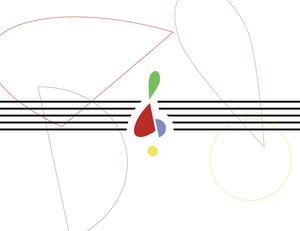
The Conservatory had used bright yellow tables in their classrooms since its inception, so I decided to elevate this and make it their signature color. I made “Conservatory yellow” the baseline to present their new complementary color scheme. The yellow shade in the logo is the exact same as the table.
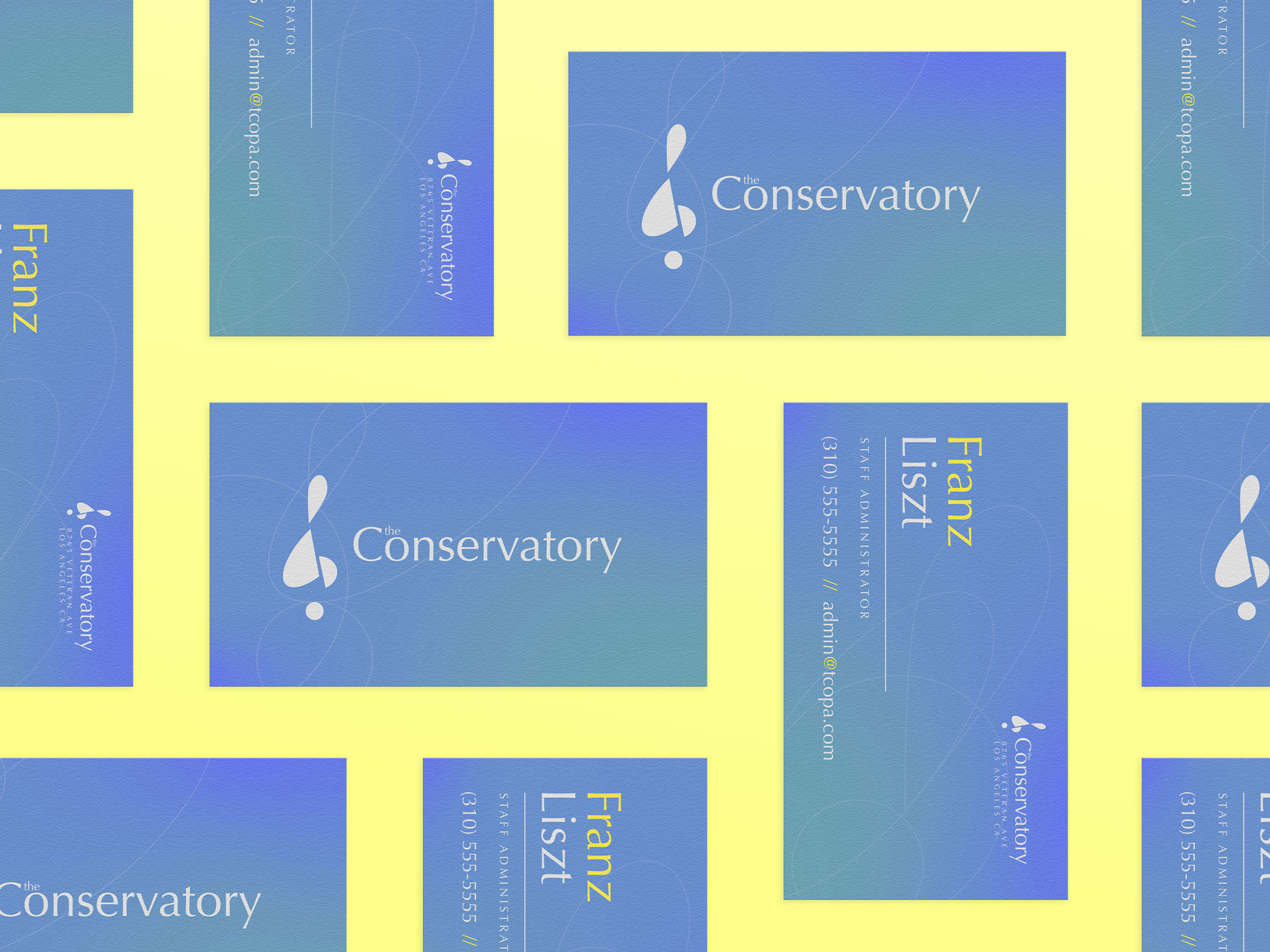
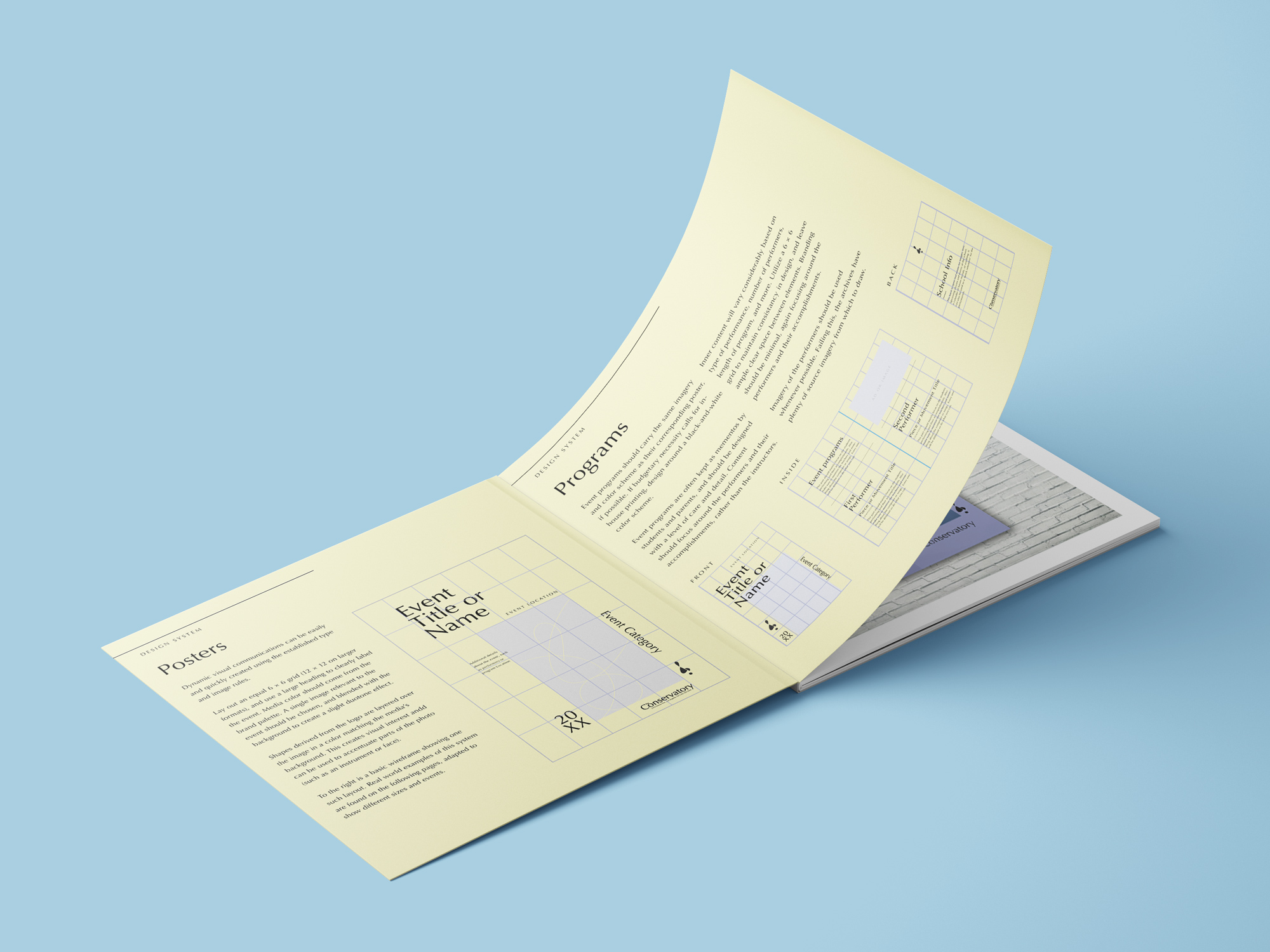
I chose Optima as the main font for a few reasons - it evokes a feeling of familiarity without being over-used, lending a certain trustworthiness to the brand. It also felt like a more modern take on an old classic, and could be adapted to many different use cases. It feels like a serif font without the serifs, and that was perfect for The Conservatory.
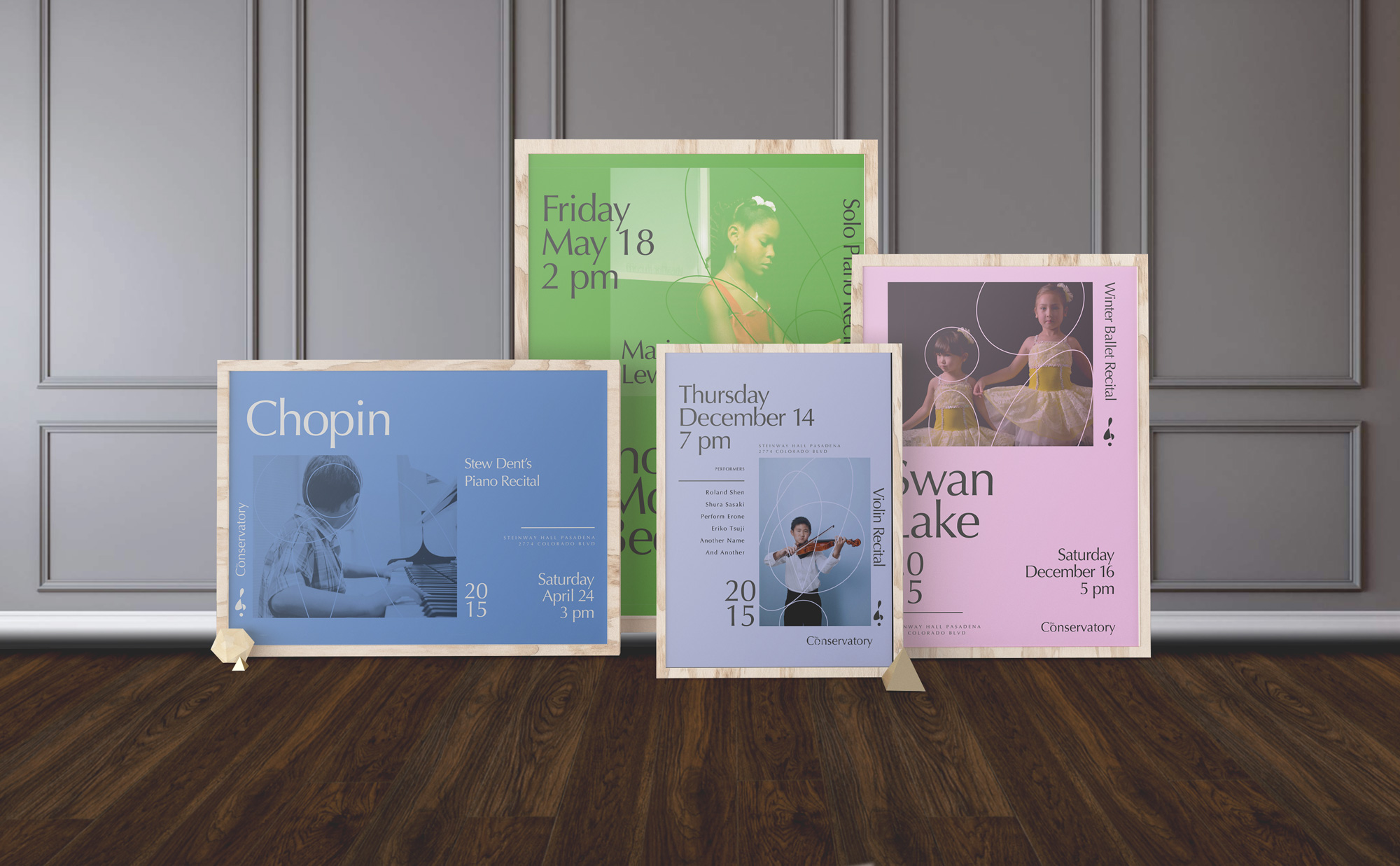
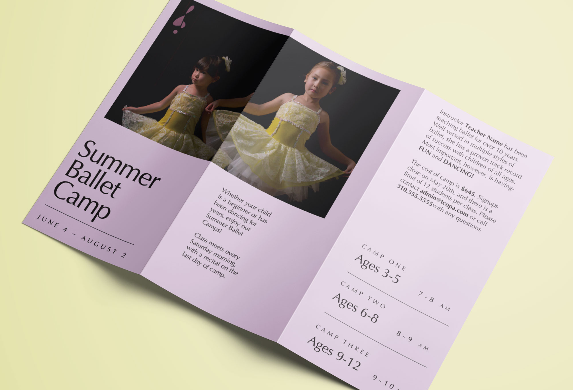
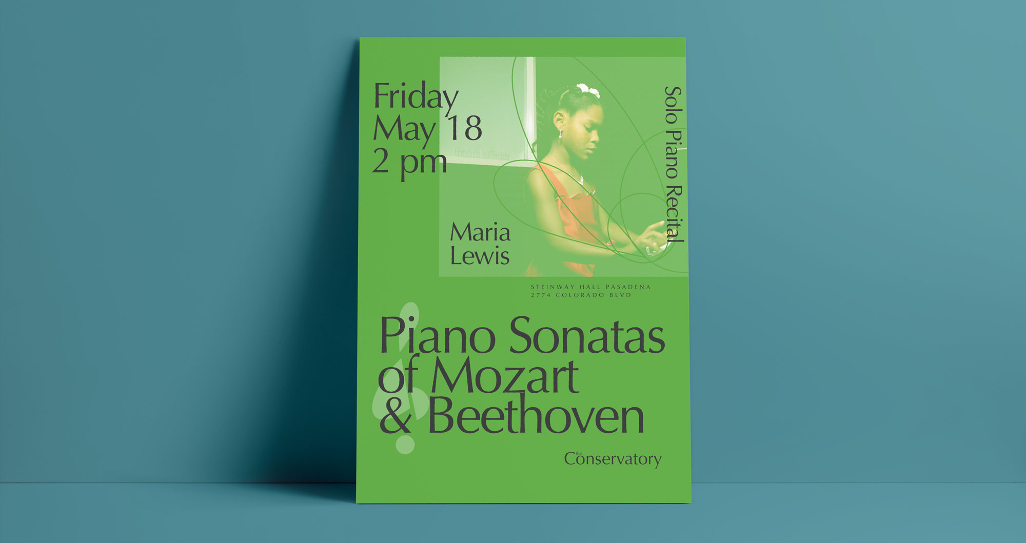
These poster templates allowed for a lot of freedom in design for various events, and were made with ease of use in mind so the in-house team could quickly tweak them as needed. The images used were photos of the students and staff I took as a part of the rebranding effort.