The Accessory Junkie
Exploring Packaging for Jewelry From Around the World
↓
This is a series of packaging and branding explorations I performed for The Accessory Junkie. I wanted to emphasize the traveling aspect of their brand, in which they source bespoke jewelry and accessories from artisans all over the world.
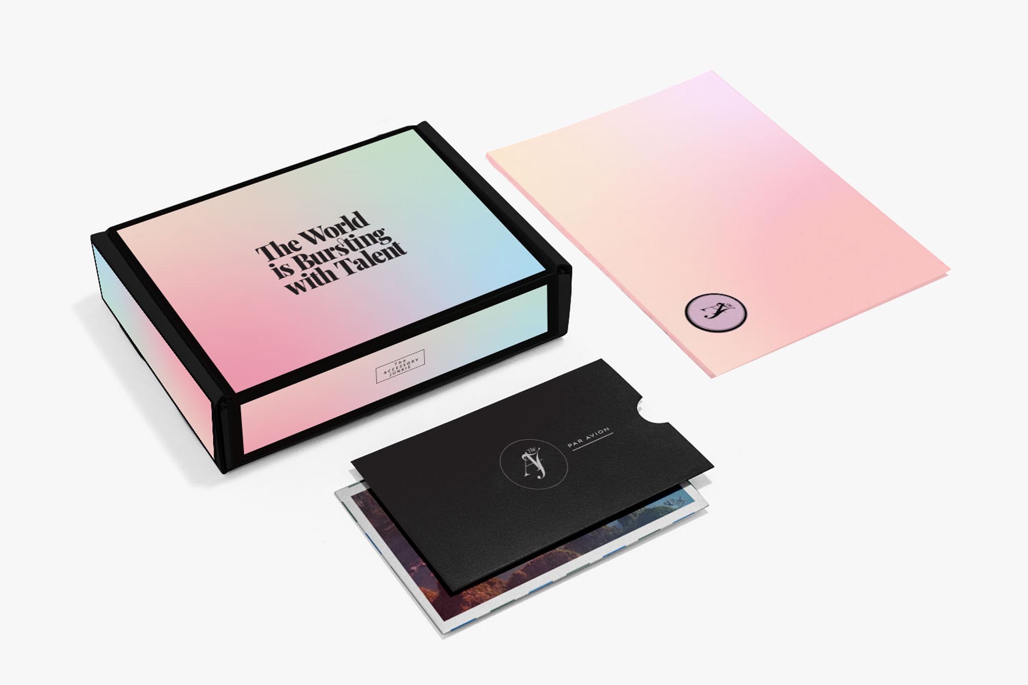
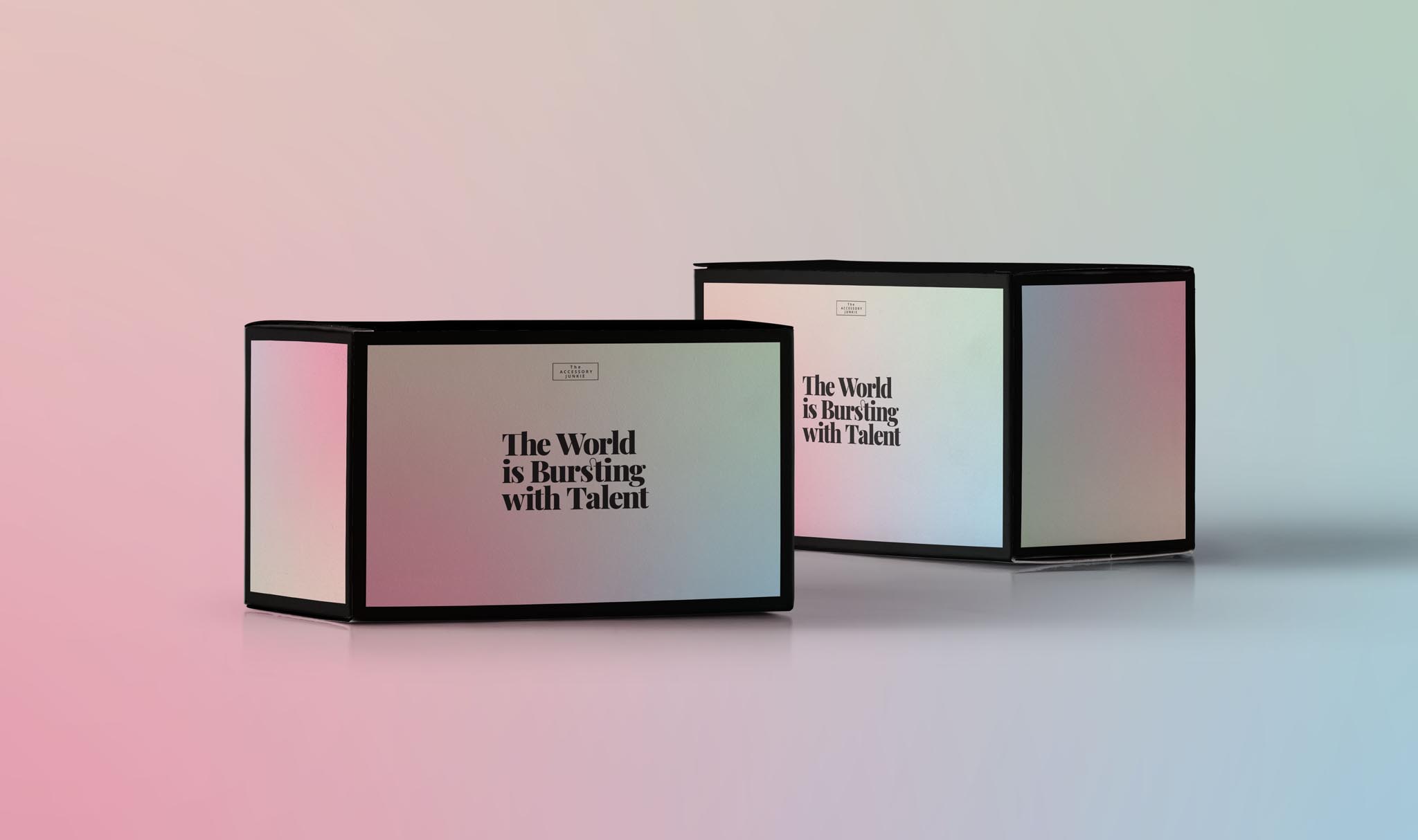
I wanted to recall the feeling of vintage luxury travel — air mail postcards, stylish luggage, gifts from afar. Bright colors and gradients were added to give everything a more modern touch, and then capped off with an elegant black border.
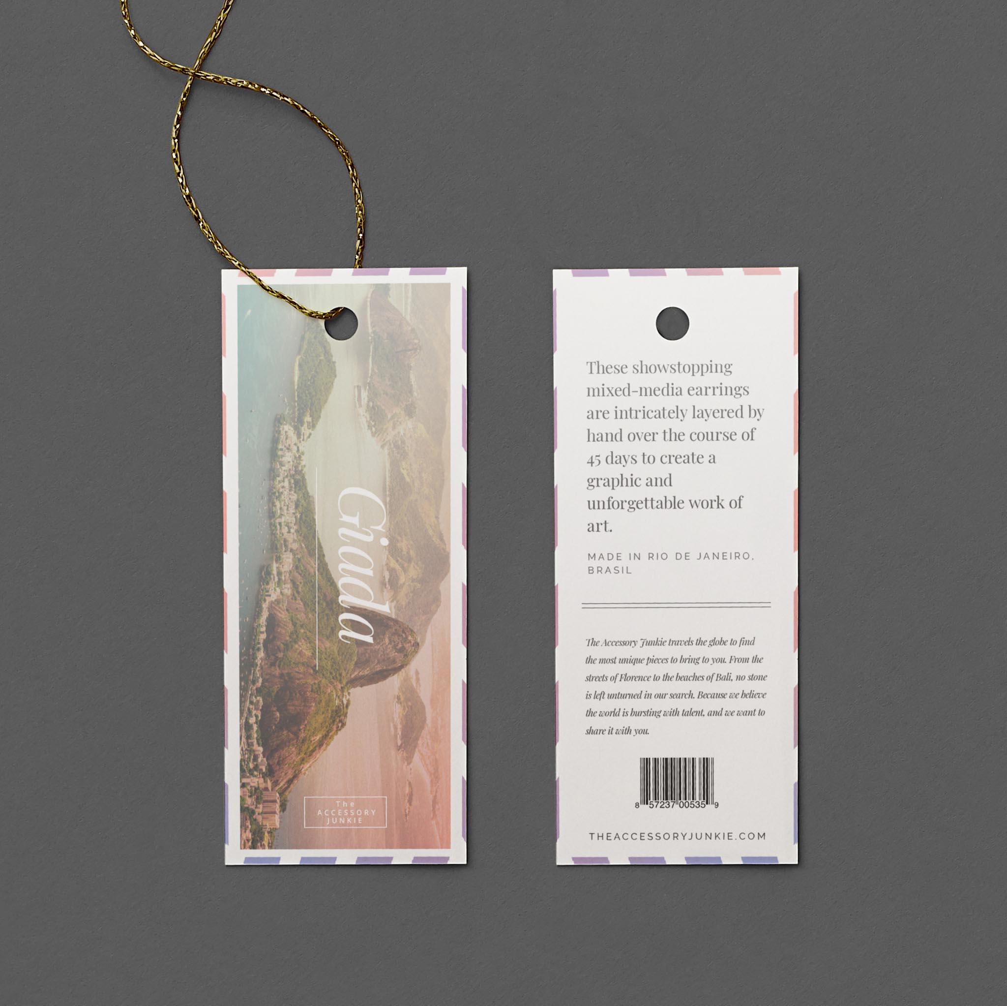
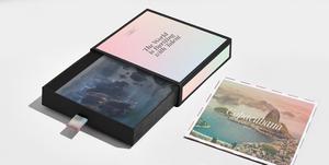
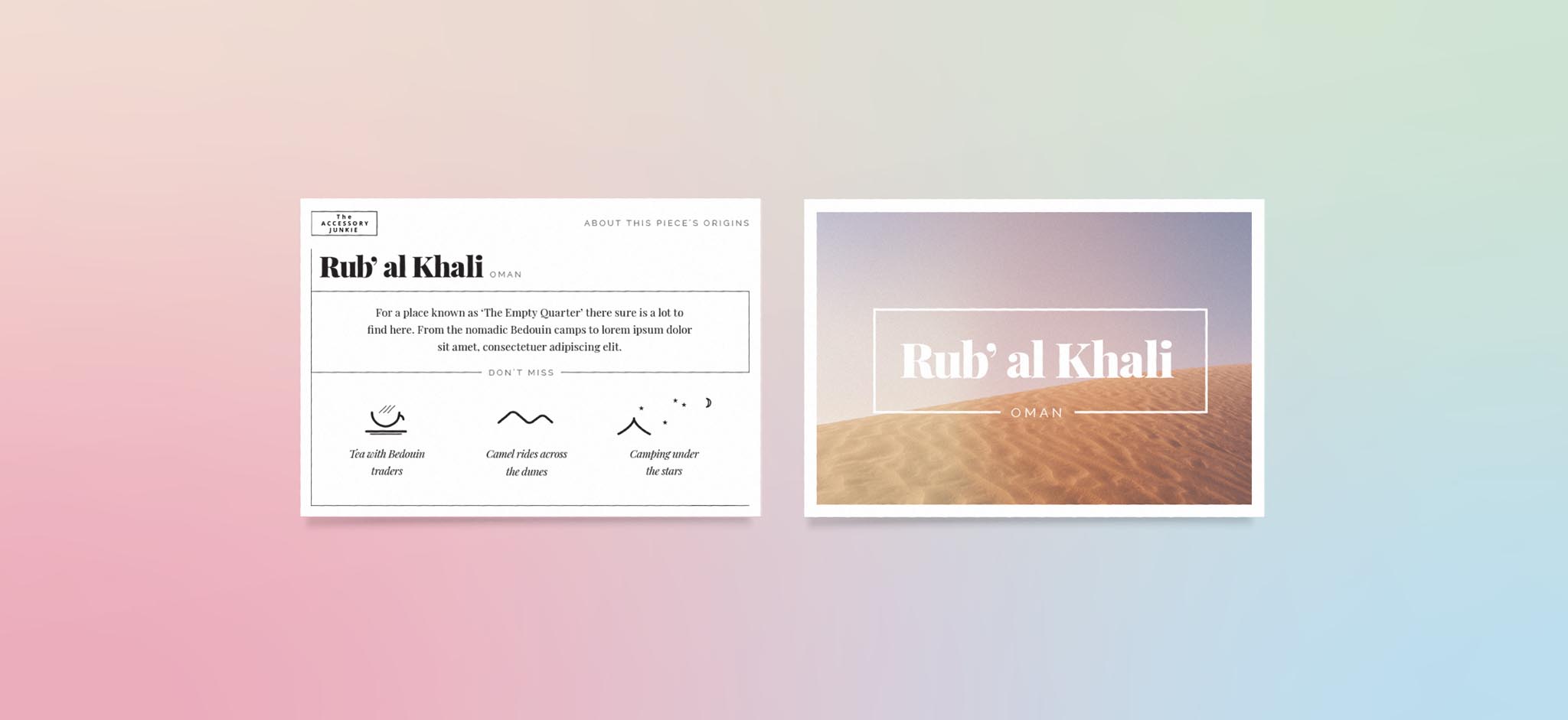
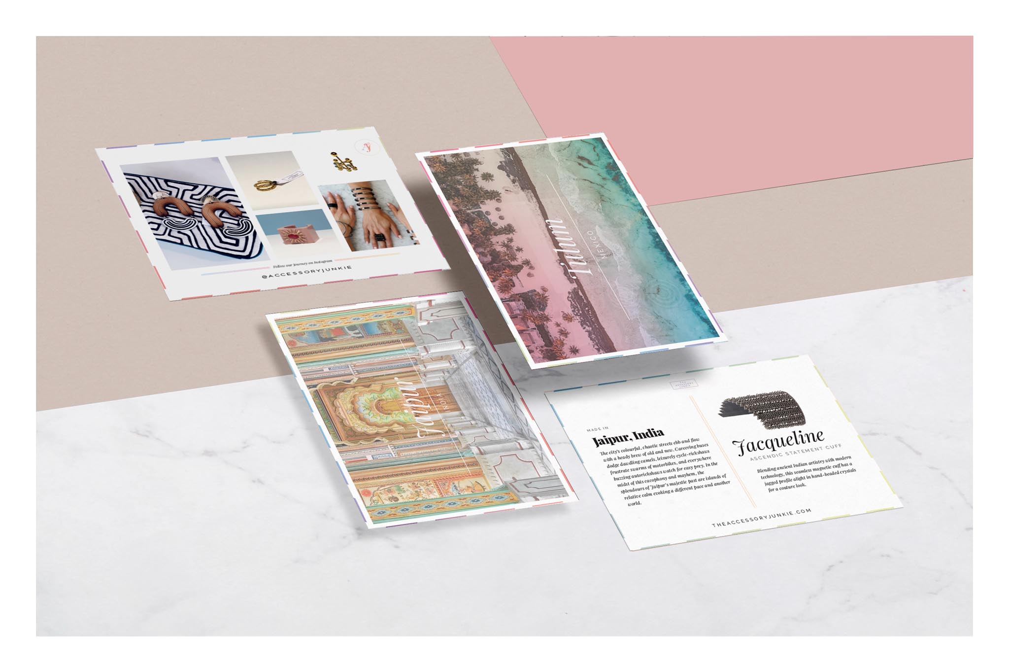
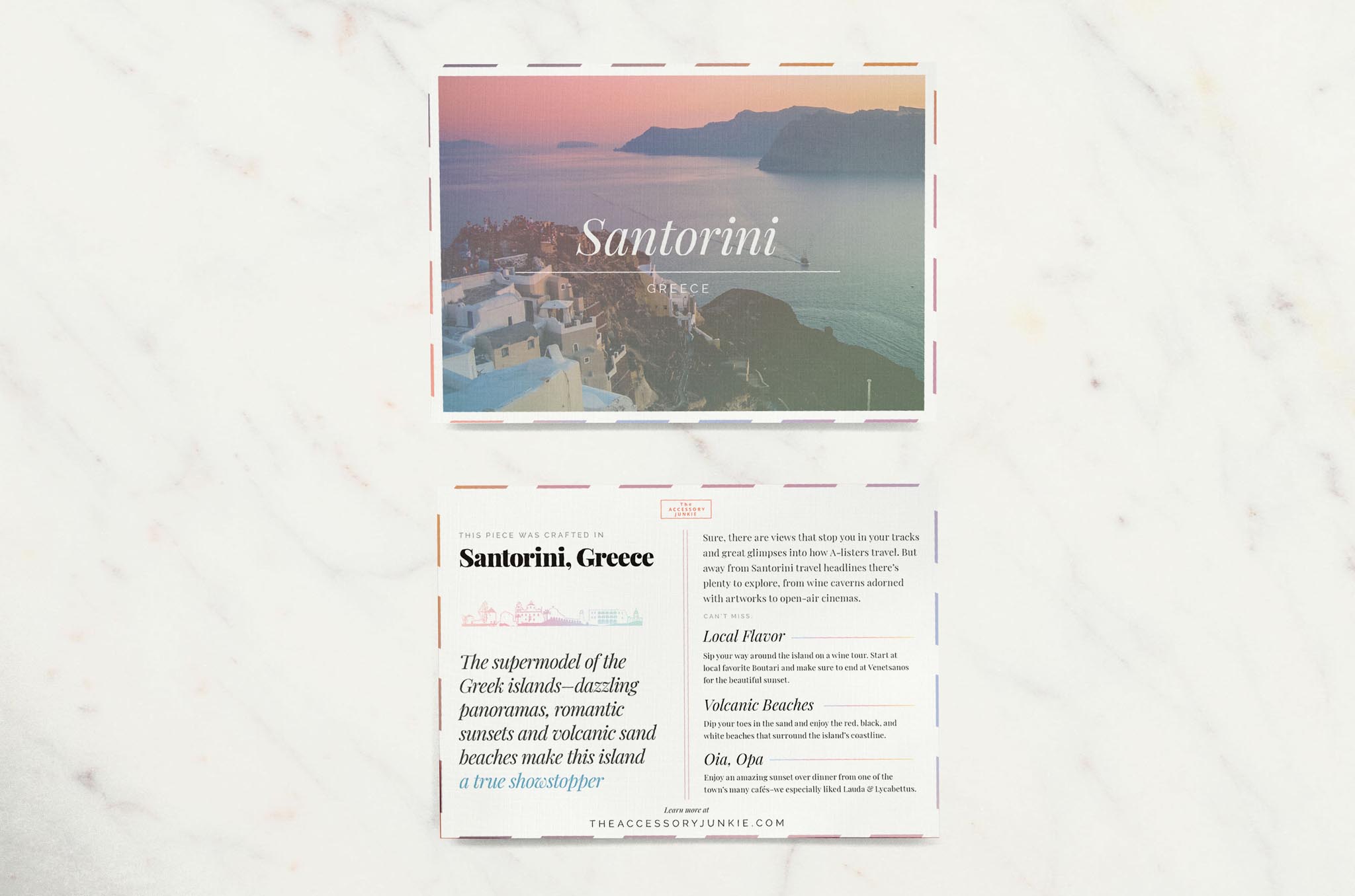
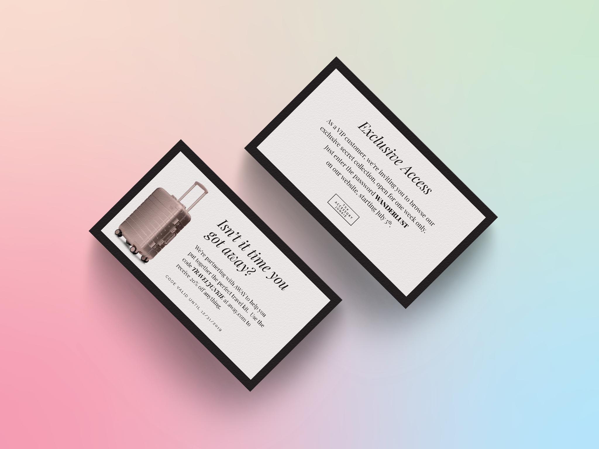
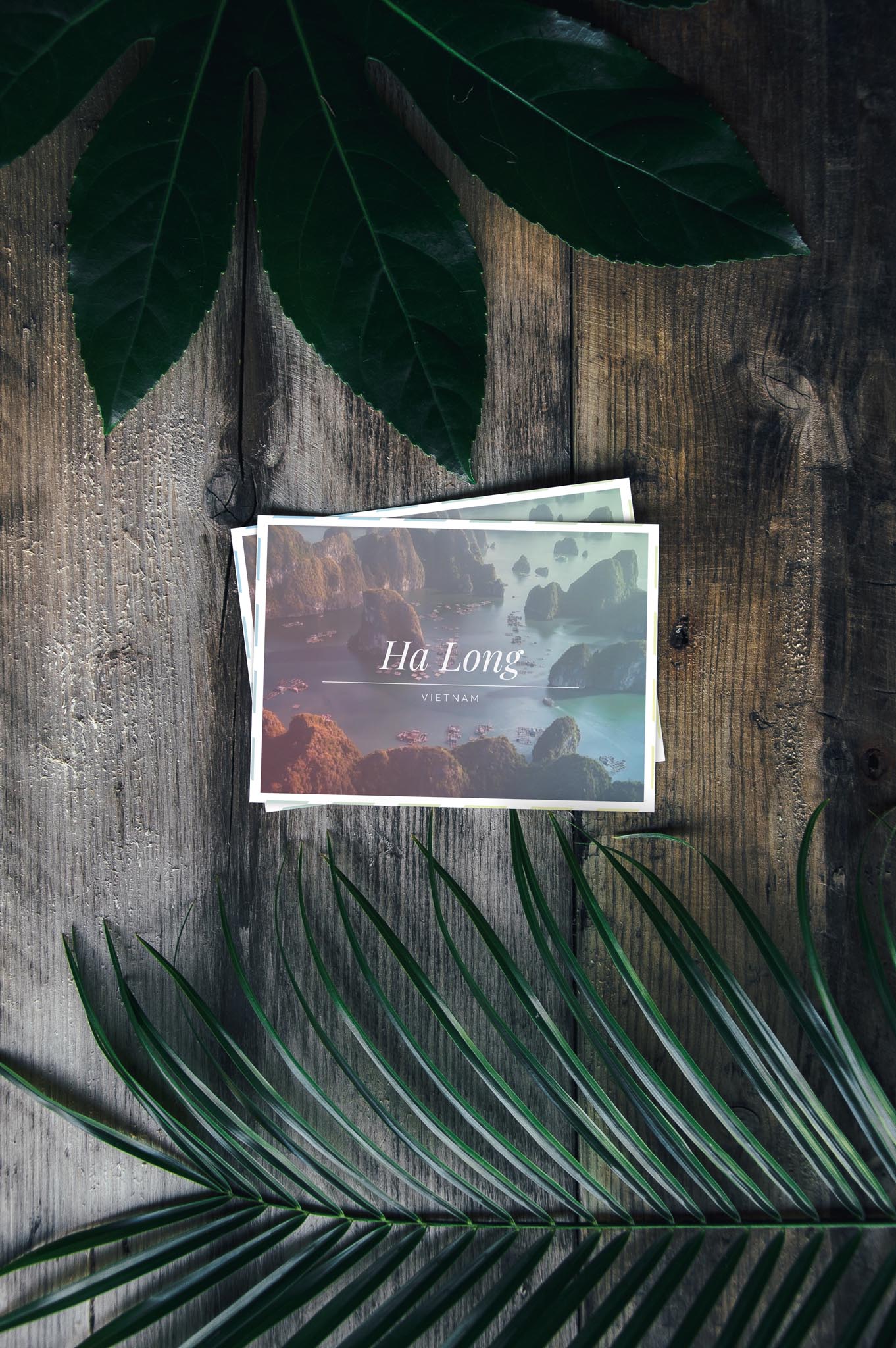
My main goal with this packaging was to create a memorabe experience for the customer, whether it was their first purchase or 5th. To do this, I focused in on the thought of receiving a souvenir from a friend. Every detail is magnified — the way an item is packed, the anticipation of having never seen it before, and the memories of trips past. Each item comes with a postcard showcasing where it was made and the heart and soul that went into the piece. The Accessory Junkie specializes in one-of-a-kind local art, and the packaging had to live up to it in every way.
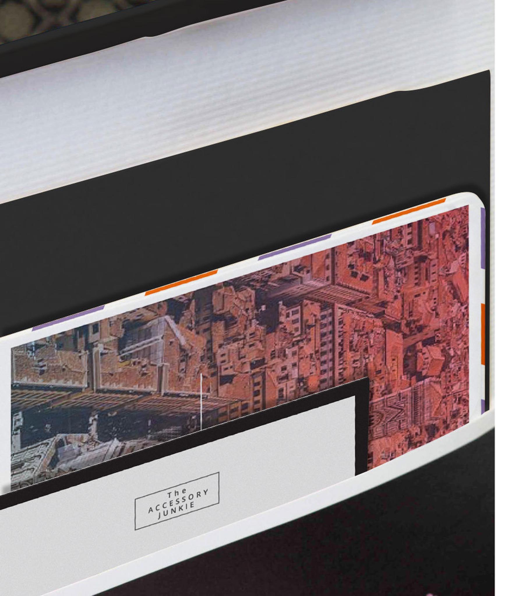

The border on these vintage-style postcards carried through to many other elements of packaging and branding, and created a natural way fo the soft gradients of the packaging to carry through to the collateral items. Multiple postcards are included with each order, including a blank one to send along to a friend.
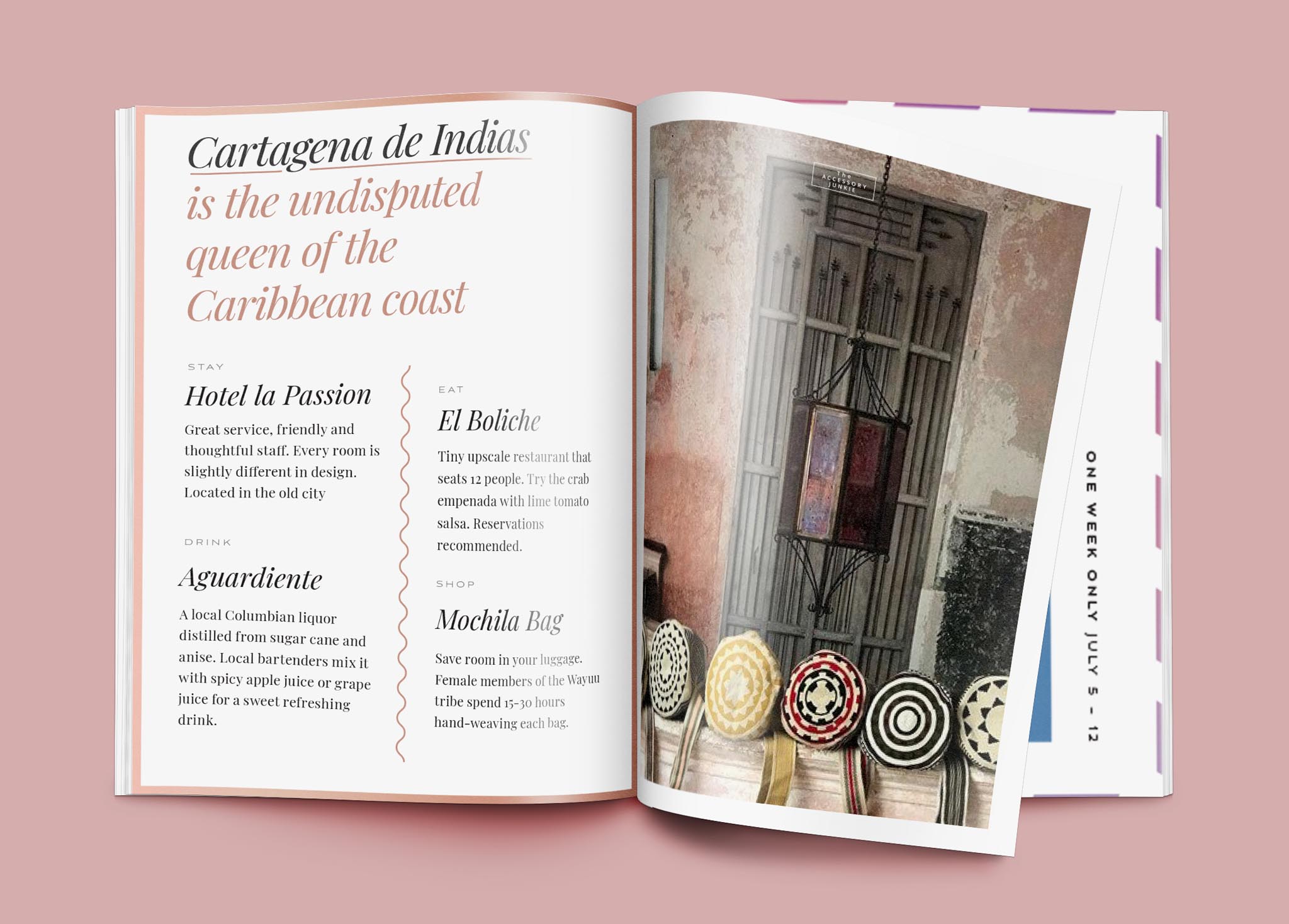
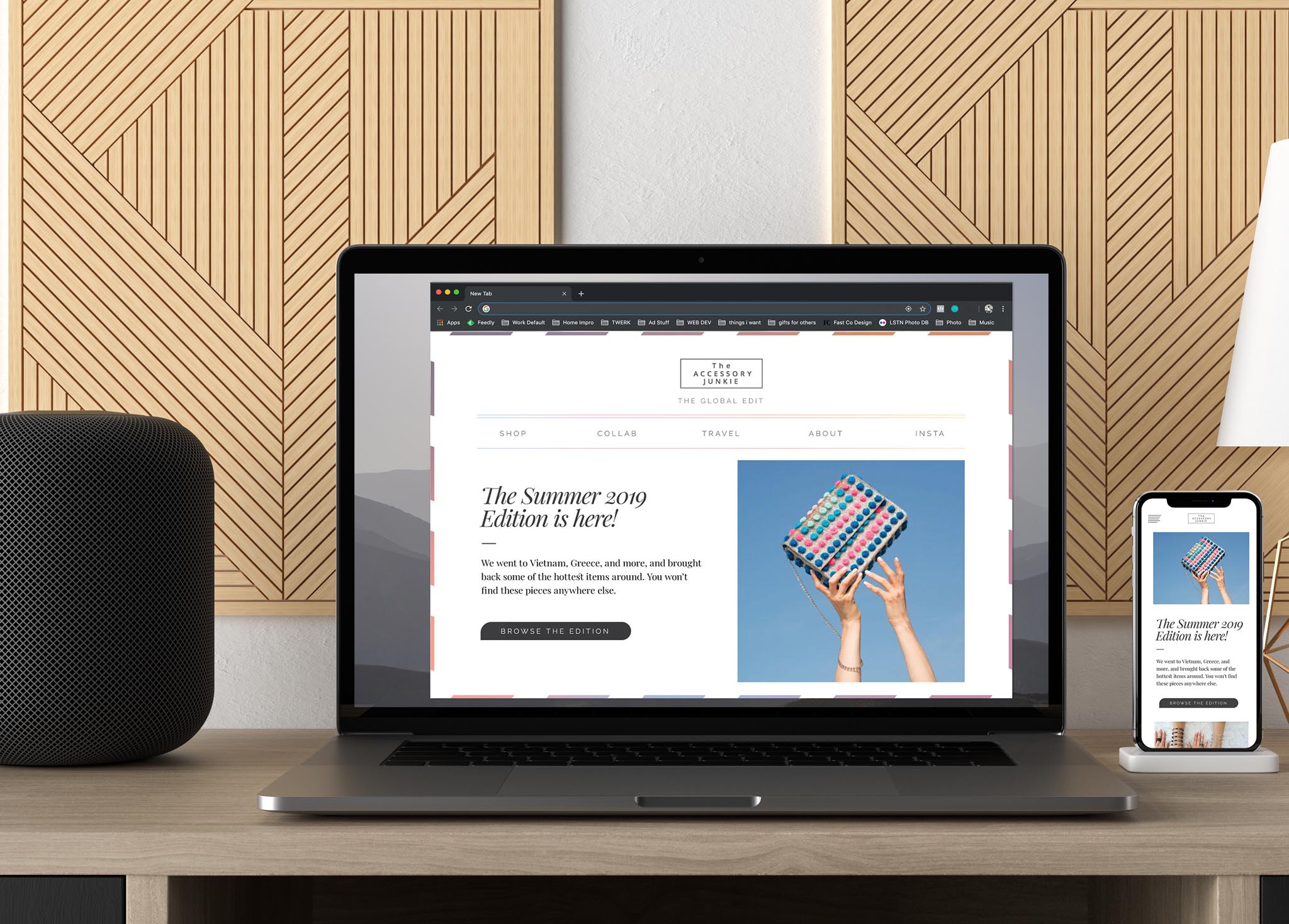
Blog posts, stories, and images from sourcing excursions create enough content organically to produce a recurring quarterly magazine. Providing a high-quality item like this helps The Accessory Junkie to connect with their customers and showcase the unique pieces and experience they find on their travels.
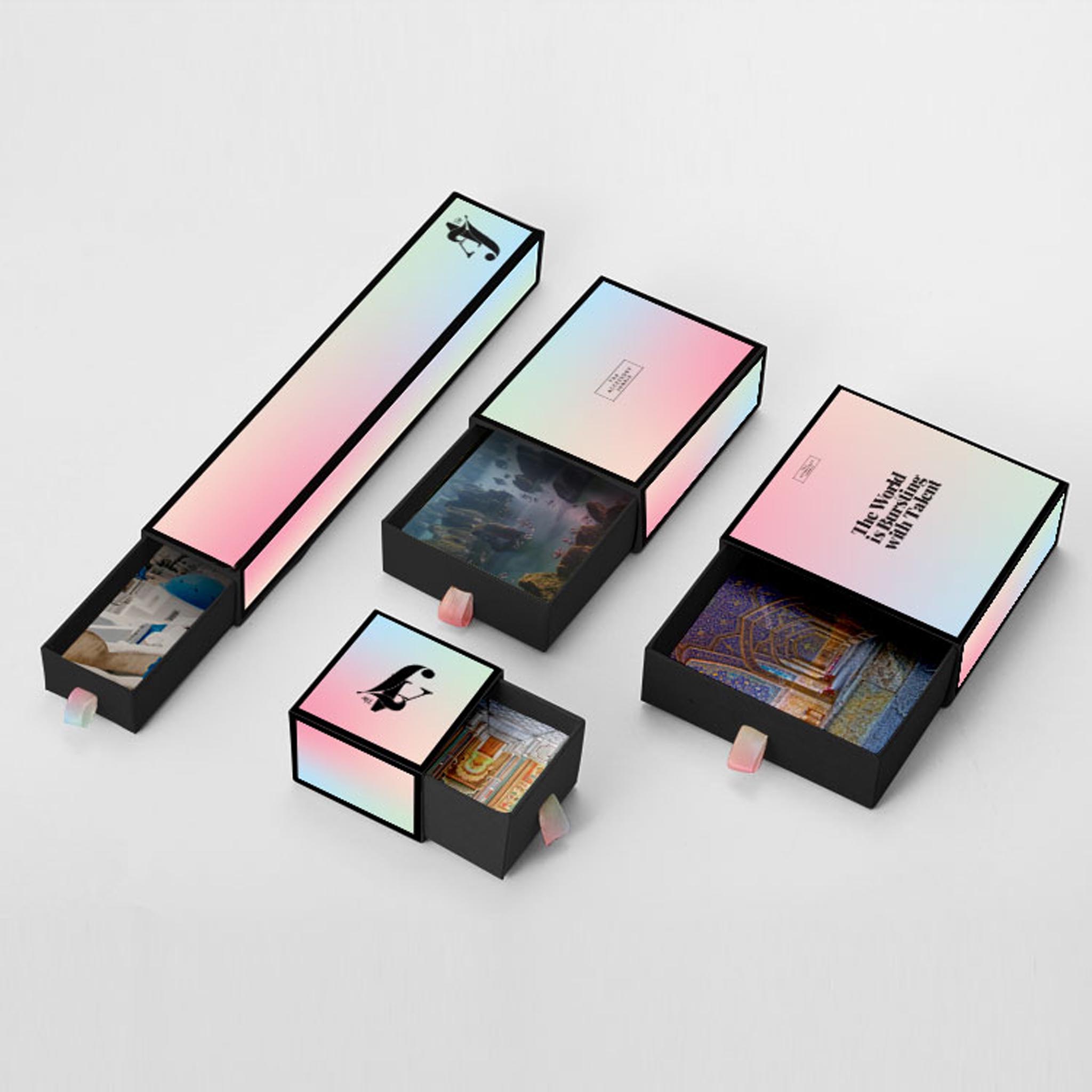
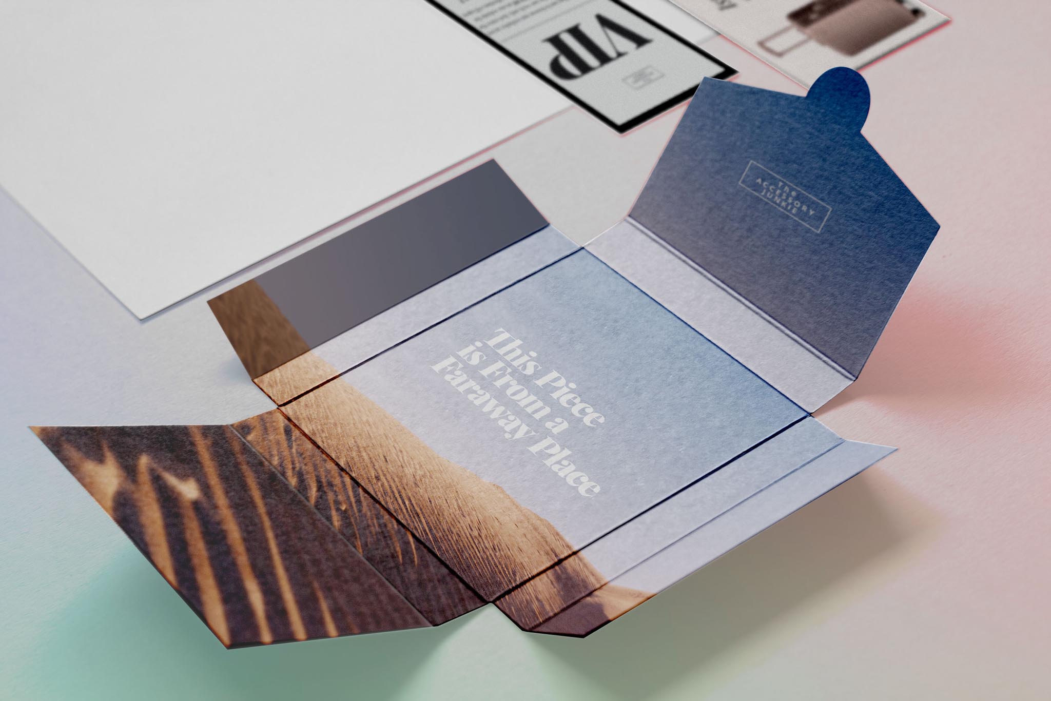
Product packaging was focused around the reveal. Our goal was to create an instant memory from the very first impression.
During our conversations we kept coming back to the moments you remember when traveling, like walking through a gateway to see a new locale open up before you. That was the impression we wanted to create when opening the packaging, and in doing so struck a clear balance with the minimal, classic exterior.
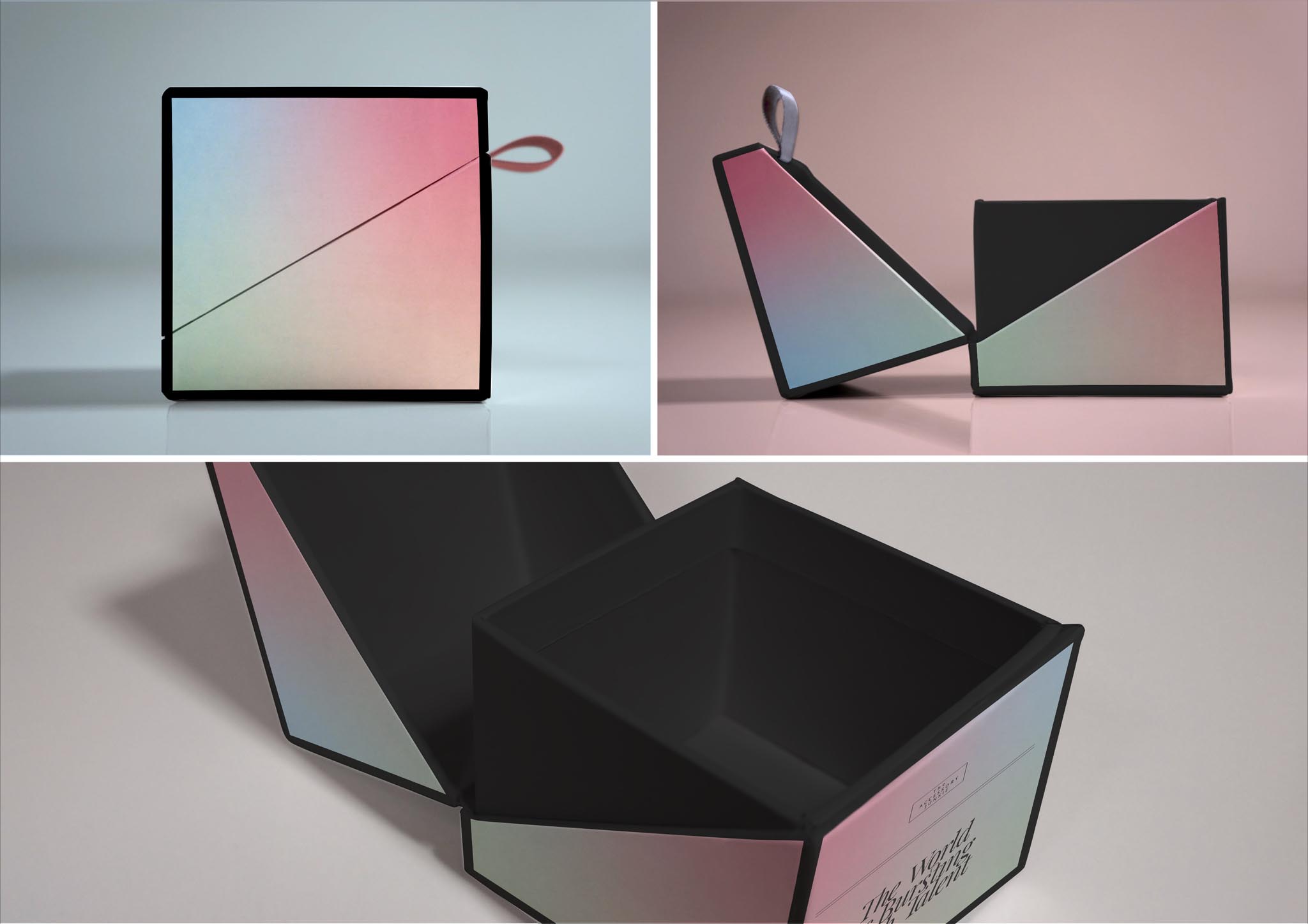
Alternate formats were explored to better suit different kinds of item, shipping costs, and the interest of repeat customers. Our solution proved easily adaptable to any format, and was able to keep the look consistent and on-brand across many material and construction options.
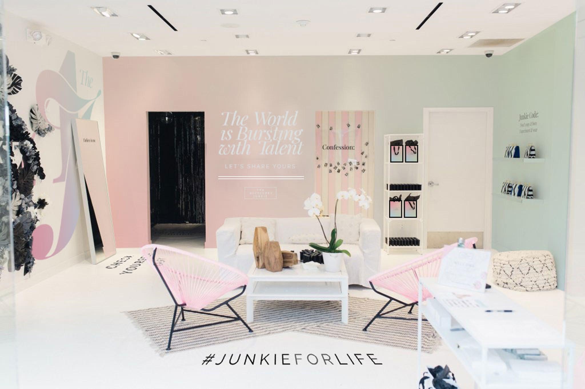
It was important to demonstrate that this idea could be carried across other brand elements, so I created mockups of pop-ups, ecommerce, and various collateral items.

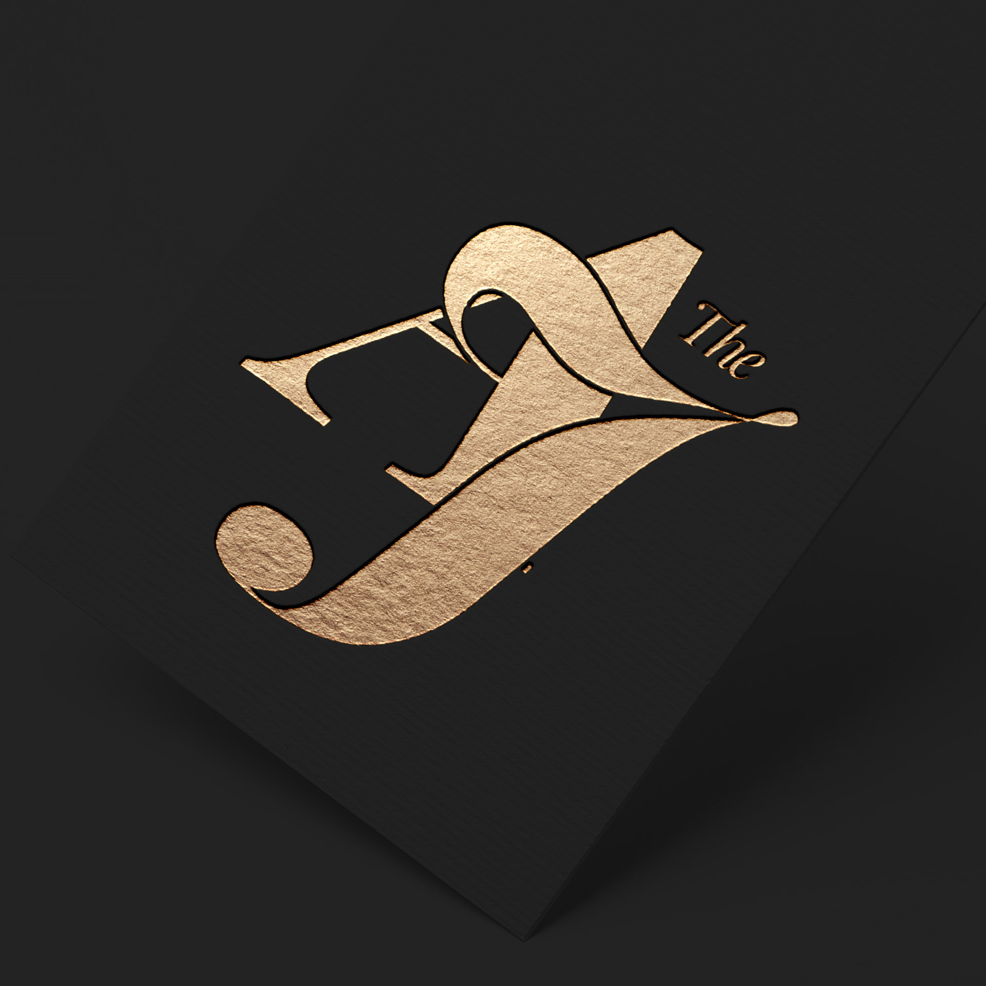
I also developed a custom monogram for use on collateral items and other secondary items. I felt it added a much needed change from the modern, geometric main logo.
What I Did:
Graphic Design:
Packaging, Print, Collateral, Product Labels, Typography, Design Mockups, Branding
Software Used:
Photoshop, Illustrator, InDesign